
Gun Death Trends – 1999 through 2016
With fresh data from the Center for Disease Control (CDC) causing the predictable odd media reporting, I wanted to post a mini-blog showing what is and what isn’t interesting about the numbers.
Raw changes
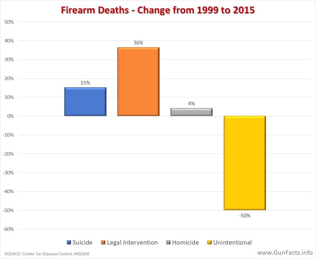 Foremost, take the chart at the right with a grain or three of salt. The changes are important, but the scale is misleading.
Of note, the firearm homicide rate is not rising much. Though is went up significantly in 2016, the firearm homicide rate is still lower than from 2002 through 2007, save one year. If we prematurely assume that 2016 was a fluke year, then realistically speaking the firearm homicide rate remains at multi-decade lows.
Before the self-defense leagues get too excited about the orange bar, the 36% increase in legal interventions is of interest, but not significant. Legal intervention shooting deaths (a.k.a. justifiable or meritorious homicides) make up about 1.3% of all fatal shootings. This is a small number and thus a small increase in the raw numbers looks like a big increase.
The trends
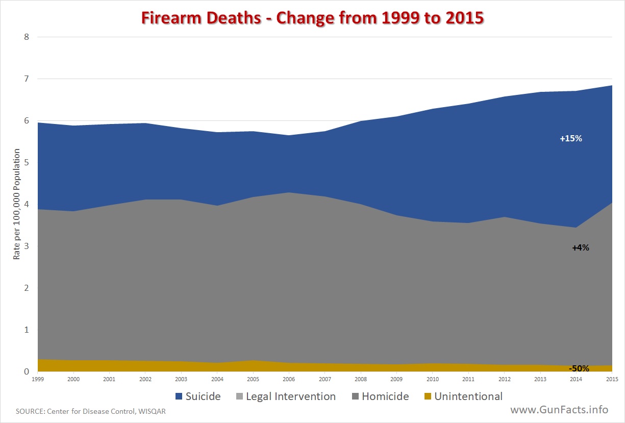 The stack chart makes that last point well. The rate of legal intervention firearm deaths is so small compared to other firearm death categories that it isn’t even visible on the chart.
That being said, we clearly see that suicides are where most new gun deaths occur. Hard times tend to increase suicide rates, and American suicides have steadily increased 20% since the year before the Great Recession started. But, as we have details before, the presence of a gun does not affect the suicide rate.
Summary
Little has changed aside from suicide rates rising (and thus gun suicide rates rising in lock-step) and the accidental firearm death rate continues to plummet, down 50% from the start of the millennia.
The first chart label at the top is VERY misleading. The chart actually shows the numbers compared to 1999. That is, the 2015 bar graph numbers are what percent of the 1999 numbers.
If it actually showed the change, the numbers on the left would be the percent shown minus 100%.
An honest critique, for which I thank you.
People like me who spend a lot of time grinding numbers tend to see 110% as a 10% increase. Thus, the chart was not to my mind misleading.
If time permits, I’ll see if I can publish a variation of the same chart using the percent change and both positive and negative axis.
It is worth noting that firearm ownership in Japan is extremely controlled and statistically insignificant. Yet, the rate of suicide in is almost one third higher than in the United States. Again demonstrating that the availability of firearms is not a causal effect to the suicide rate of a population.
https://www.japantimes.co.jp/news/2014/09/04/national/japans-suicide-rate-exceeds-world-average-who-report/