
Auditing Australia
“Australia,” said Hillary Clinton, “[is] a good example …” concerning gun control.
But what precisely is it a good example of? Certainly not homicide.
Major take-aways:
- 1996/97 gun ban and confiscation had no effect on homicides
- Ban may have led to increased sexual assaults
- Unarmed robbery fell faster than armed robbery, showing a disconnect
The history and the current political claim
In the wake of a mass shooting in Port Arthur, the Australian government orchestrated a “National Firearms Agreement” whereby all the states within Australia would enact tougher gun control (the various states within Oz largely had their own localized gun control regimes). The system banned all semi-automatic rifles, all semi-automatic and pump-action shotguns, and created a restrictive system of licensing and ownership which was nothing short of draconian (then again, what can you expect from a government that censors Internet content). The government was legally compelled to compensate people for the loss of their firearms, so they instituted a program to bribe people to comply.
This was a bit of a failure. In the span of a year, Australians surrendered about a million guns (from a population of over 18 million people). Unofficial estimates conclude that maybe 20% of the gun owners in Oz complied with the new law. 1 So claims about any serious fall in crime, much less an association of such to a gun ban, strain credulity. This includes certain politicians in the current American presidential election.

SOURCE: FACTS and Figures, 1998, Australian Institute of Criminology
It should be noted that in terms of homicides, Australians never had that much to worry about. The place is huge, the population is small, and the people are spread out. This fact of geography – paired with a rather laid-back culture and a dearth of sociopathic street gangs – contributes to subdued hostilities. Australia’s homicide rate is about half that of the USA during periods of non-prohibition (where America banned alcohol and later drugs is strongly associated with abhorrent spikes in Yank homicides).
So, what happened (or didn’t)?
The question then is whether the gun ban in Australia had any effect. The short answer is it did, but maybe not in a good way.
First, I need to point out that though various agencies of the Australian government collect criminology statistics, it can be a challenge to gather them. The single best and consistent source for homicide stats only went back to 1989, a mere seven years before the Port Arthur massacre. But that is enough to get a sense of the before and after.
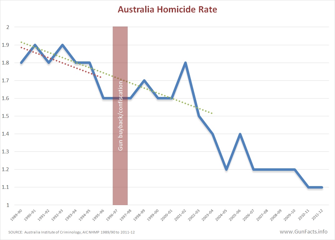
click for a larger, sharable version
What we see is that homicides in Oz were on the decline before the Australian gun “ban.” In fact, the slope of the homicide line for seven years before and after the ban are identical down to four decimal places (a slope of -0.0286 for my fellow number nuts). If the gun ban was designed to impede homicides, then it had zero effect (it is curious to note that homicides fell sharply starting around 2002 – but we’ll discuss this a little down the page).
The important points are that:
- Homicides were falling before the gun ban.
- They were falling after the gun ban.
- The rate of decline was identical before and after.
- Even allowing for a generous lead/lag affect, no homicide decline can be attributed to the gun ban.
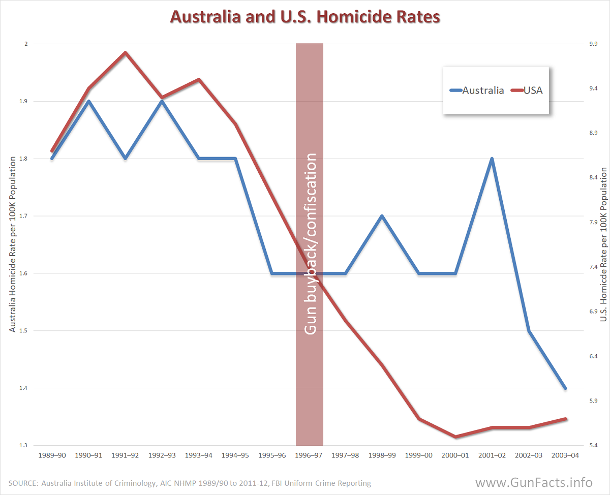
Foreign perspective
Perhaps more enlightening than this time-series for Australia alone would be to compare homicides in the same period with the United States. After all, American politicians campaigning for gun control and using Oz as a model need to prove that a Down Under approach is “a good example.”
 click for a larger, sharable version |
 click for a larger, sharable version |
 click for a larger, sharable version |
Using the same +-7 year span before and after the Australian gun “ban,” all other things being equal, the theory states that America’s homicides would have gone wildly higher since Americans were continuing to buy guns in annually increasing numbers.
Hillary is not going to be happy. As the chart demonstrates, homicides fell faster and further in America than Australia. Given Oz’s relatively low starting homicide rate, they perhaps had less free fall room than the United States. But this decline occurred during a period when America went from 16 to 36 states (32% to 72%) that allowed people to carry concealed firearms in public, and for which many of the states rolled back firearm restrictions.
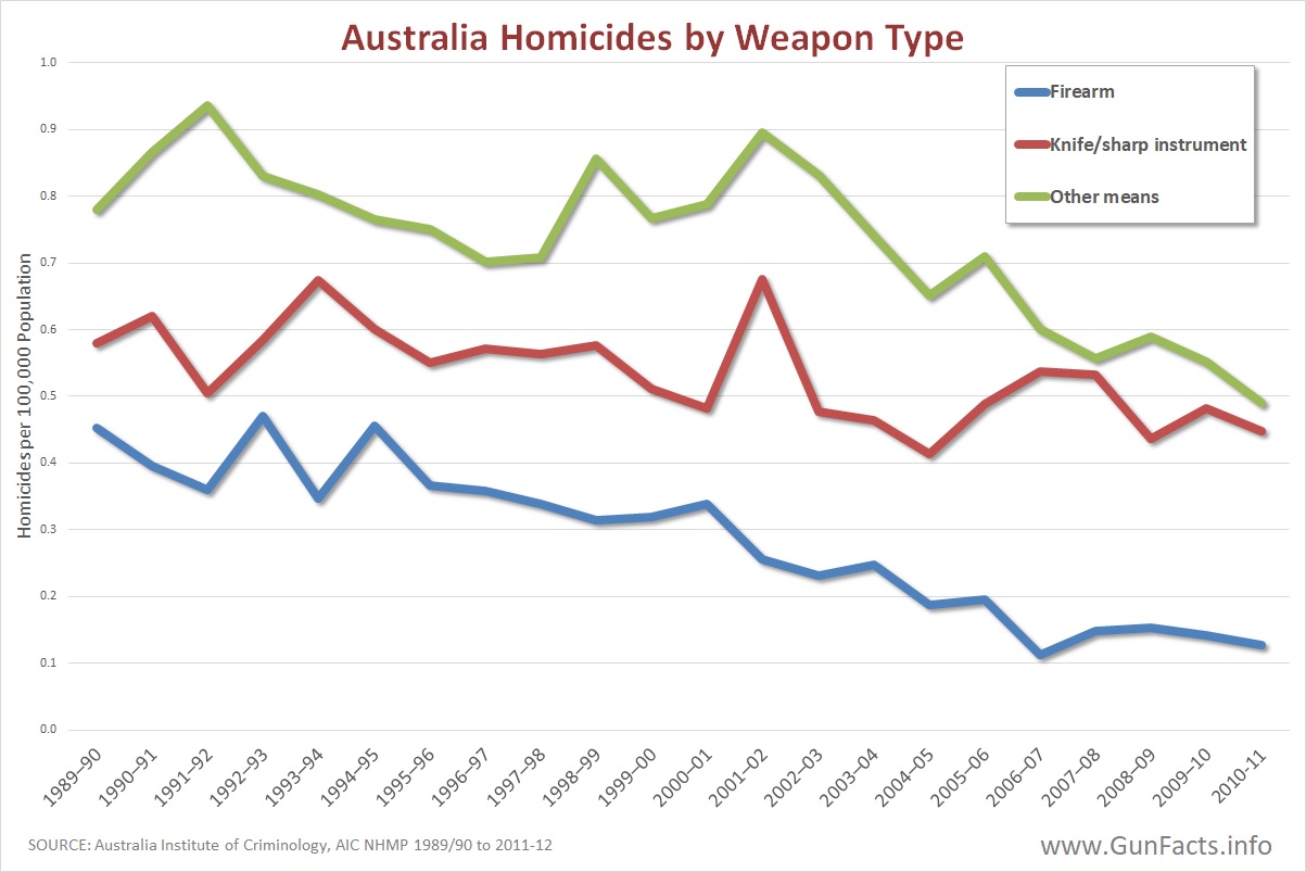
Guns do not appear to have been a huge swing variable in Australian homicides. But other forms of murder were. A sad secret is that murderous Ausies never resorted to guns much. They have traditionally been much fonder of using knives, bare hands, blunt objects, fire, poison and other means.
But this is where we find some meaningful insight. Recall that we could not earlier explain the dramatic drop in homicides starting around the year 2002? What we see is that homicide by something other than guns and knives dropped rapidly starting in 2002. For the years 2002 through 2011, the rate of decline for “other” means of homicide fell nearly three times faster than for guns (oddly, both gun and knife homicide rates fell at about the same pace).
This last bit is vitally important to the gun control industry. They will point to the long-term homicide rate decline and claim that the gun ban was responsible. But it was not gun control or knife control that did the trick since most of the decline came from neither of these weapons.
Other violent crime
A good question to ask is if any other effects came from the Australian gun “ban.” Were any other forms of violence abated or encouraged? The bag is decidedly mixed.
Of all mayhem, homicide was the second least affected after the gun “ban” (the least affected was manslaughter). Armed robbery fell, but unarmed robbery fell even faster. Even kidnapping dropped on a steeper slope. However, rapes rose. This is not proof that gun control leads to rape, but one cannot claim women are safer from such assaults in a disarmed society.
So what is a “good example”?
Let’s lay to rest a few myths about politics, policy, Australia and guns.
- Like the UK, Australia has an admirably low homicide rate. But it was that way before gun control.
- Modern gun control in Oz did not change the rate of decline in homicides.
- The entire Australian gun “ban” was at best an exercise in how to waste millions in taxpayer money, because it had no demonstrable effect.
Hillary Clinton may be right. The Australian gun “ban” is a good example of what not to do.
Update
When a political talking point gets debunked, a propagandist will change the meme. As of this update, the revised claim about Australian gun control in the wake of the Port Arthur Massacre is that “it was design to prevent mass murder”.
 click for a larger, sharable version |
||||||||||||||||||||||||||||||
|
||||||||||||||||||||||||||||||
Well, someone should tell the mass murders in Oz.
In this chart we show the number of Australian mass homicides and and the number of people killed each year. We added a 10 year moving average to smooth-out the trend. Even casual observation shows that the alleged desired effect – to reduce mass homicides – didn’t happen.
Just be be certain of the facts, we decided to also calculate the rate of events and deaths per the changing population. This actually made the matter worse.
In the cases of both the number of incidents and the total body count, on an average annual basis, both increased instead of going down. Perhaps not by much, but clearly in the wrong direction.
To summarize: the laws did not reduce homicides (more than the established downward trend) or mass homicides (which actually increased) and may have encouraged other violent crimes.
Good going Oz politicians!
Notes:
- New National Gun Laws – are they cost effective?, Lawson, Review, Institute of Public Affairs, 1999 ↩
I am having a bit of a hard time with the charts. I recognize they come from other sources, but the X axis scales make it difficult to compare the shapes of the lines. The blue lines should all have the same shapes but they are different enough to cause consternation. Any way to fix that?
Also, please make better distinctions between total homicide rates and firearm homicide rates in the text and charts.
I think this is a good story, but to be really effective it must be ironclad as to what the data is saying.
Click on any chart to get a much bigger version of it that is easier to read.
The difference in the shapes of the blue lines are due to the time spans involved (first one goes out to 2011 whereas the third is a shorter equal before/after perspective).
Aside from the next-to-the last,m we are not breaking out firearm homicides.
I don’t think the X axes are a problem but the cases where there are dual Y axes on a single chart without a legend to know which of the lines is represented by which axis means that comparing absolute values is a challenge – though I get that the purpose of the charts is to show the overall change in rate rather than the specific numbers and the range on one might need to be larger than the other to avoid one of them looking like a flat line. It can be misleading if you have one axis with a range of only 1 from min to max and the other range is from 70 to 100 or a span that is 30 times the size. Sill if one dropped in half and the other doubled then the raw numbers may not be critical to making the comparison – labeling the Y axis would still be good so we can see if that is 1.8 homicides per year or per 100,000 people or what. Or – if possible – use the same total span but base shifted – for example if the data in one set spans 2 through 6 and the other spans 10 through 20 then using 0 through 10 on one axis and 10 through 20 on the other makes the scale of each a span of 10 but shifts the sets so they overlap more closely.
Matt, your comments are well taken.
The main purpose when using two different Y-axis scales is so a comparison of the slopes of the lines.
Time permitting, I’ll see if I can add the Y-axis labels, though you read correctly that these are incidents per 100,000 population for all.
Great article! I had read something similar in another article explaining that Australia’s homicide rate was already declining BEFORE the Port Arthur massacre. And that homicides continued to decline at the same rate after the massacre. Hence, no one can say that the ban/confiscation was effective at reducing firearm violence. I like that this article uses the term slope. I don’t want to sound elitist, but many people struggle with algebraic concepts such as rate/slope. Most people simply look at the numbers nominally, and see that there were fewer gun related deaths after the ban, and are therefore content that the ban was successful. I’ve debated others about the effectiveness of the Aussie gun ban, and when I mention how the rate of decline, aka slope, did not change, they get that deer-in-the-headlights look on their faces. Then they do what progressives are so famous for…because THEY don’t understand, they call you names in an attempt to discredit.
BTW – love all of your graphs! One thing I would like to see changed (and see another thread addressing the same thing) would be to include labels on the vertical axis’s (sp?). I had guessed they represented number of incidents per 100K people.
Thanks for the note Dave.
I do need to be more careful about axis labeling. Sometimes the info is related in the chart title, but more often than not I am so familiar with the metrics that don’t think about how this adds clarity for other folks.
Since the graphics are designed to be shared (and click on any of them to get a larger image) it would be worth the added effort as it may more completely educate people not well studied in the topic.
The stats of homicide rates in all australian statistics offices (including the ABS) show a sharp increase in 1996 due to the 35 people killed in a single massacre. There is clearly no increase in 1996 in any of the stats for Australia here (and even a decrease in homicides by firearm specifically). You have clearly altered these numbers.
All numbers came directly from the Australian Institute of Criminology, both from web site data exploration tool extracts and some they guided me to by request. All the data is public, so feel free to cross verify.
Please note, like all criminologist, we use homicide rates (#/100,000 population). Transient events like the one you cite do not create abnormal bumps in charts.
Acknowledging that you can only be *so* concerned with the opinions of internet randos – I would still love it if you added the label (#/100,000 population) to all the charts since it is intended to inform non-experts. Thanks!
Thanks for doing the legwork on this. Much appreciated.
After reading your recent article about gun deaths, I’m wondering what the homicide rate includes. Is it limited to murders or does it also include accidents, suicides, and/or self defense killings?
https://aic.gov.au/publications/mr/mr23/about-national-homicide-monitoring-program
“the term homicide refers to a person killed (unlawfully)”
“Excluded from this definition are attempted murder and violent deaths, such as industrial accidents involving criminal negligence (unless a charge of manslaughter is laid). Lawful homicide, including that by police in the course of their duties, is also excluded.”
Thanks for the quick response.
maybe the slant was due to DNA techniques and the belief amongst the more intelligent that it is harder to not leave evidence hence the lowering slant
Very dishonest graphs. 5.6 homicide rate for the U.S. yet graphically it shows it to be lower than the Australian homicide rate at 1.8. All you’ve done is destroy the credibility of people who use your information.
I’m guessing you missed the second vertical axis. Both are labeled, one for Oz and one for the U.S.
We scaled the axises so that the relative slope of decline for each country would be readily visible. Had we not done so, the gap between the two nations would have made visualizing and understanding the relative rates of change difficult.
Worry not. Though few in number, you are not the first person to either not notice the second axis or to not understand purpose of the slope comparison.
I’ve plotted it on a graph with a singular value Y axis and the representation of relative decline is still present and easier still to understand.
The only difference is that the boom and busts are not so abrupt and really a .1 difference isn’t significant.
The graph would have you believe a .4 decline is equal to a roughly a 2.4 difference due to the representation graphically.
As I said before, the goal was to demonstrate the slope of line for each nation. The rate of decline vis-a-vis legislative changes.
Well, you are saying you want objective analysis, but in Figure 1, you show a clearly increasing regression (trend) line for gun deaths from 1915 to 1995. Then you choose, however, to instead pick what seems to be a local maximum or even all-time high in 1989 and a very short timeline from 1989 to 1995 to claim there was a falling regression (trend) line. While this is ‘not wrong’, it does strike me as cherry-picking (all-time high, very short timeline) to suggest a trend that is in contradiction to what you show in the earlier figure. Everything is down from the all-time high for some period, duh. This is clearly disingenuous. If you were looking at the total timeline of available data, as you actually have in your first figure, then it is clear that in general 1915-1995 we have a slightly increasing trend line, and from 1995-2010 we have a falling trend line (1995=1.6, 2010=0.4, per your Figure 4, 2023=0.01, per UN). No offence, but it reads exactly like the “BS” cherry-picked/misinterpreting analysis you say you do not like?! Data scientist here. Comment appreciated.
Not really.
The first chart was provided without data tables, and was largely reconstruction data (not formally collected stats). The other data, provided to us by the Australian Institute of Criminology, was formally collected. We showed both to ensure that readers understood the supposed long-term but reconstructed situation, and then the modern and properly collected data specifically as it relates to 1996 legislative changes.
Data quality and consistency is a perpetual issue in criminology.
Have you seen “ Association Between Gun Law Reforms and Intentional Firearm Deaths in Australia, 1979-2013” doi:10.1001/jama.2016.8752?
The 96 gun control reduced availability of rapid fire weapons do would expect a reduction in incidents and casualty rate. The figures provided stem to support this.
We know it.
The two problems are this:
1) They only measure mass shootings, not the broader subject of mass murders.
2) The cut-off date of 2013 omitted later mass shootings (see chart below).