Charting Homicides
At the Gun Facts project, we like to add perspective. This is the opposite of what various gun control groups do, which is to mask perspective.
That perspective stuff can be inconvenient.
What is the measure
One claim by the gun control industry is that more guns leads to more murder. Over the years we have demonstrated that, on an international level, there is no statistical correlation between gun ownership rates and homicides. Some of our charts have become quite popular with the media as they vividly show your odds of death are significantly higher outside of America.
But we were never happy with the measurements. Homicide rates are too abstract. We wanted a better way to display the chance of being murdered against the chance that someone you met owned a gun.
In this very brief spasm of charting, for each country that reported them, we took the homicide rates (odds of being snuffed) and divided it by the private firearm ownership rate. Murder/Stockpile.
Fun with charts
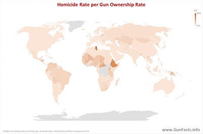
The first chart was a standard issue world map. It is interesting in as much as the United States is in the same color bands as most of the civilized and war free world. In fact, numerically speaking, the U.S. of A. was the 16th lowest of the 170 countries we could extract data for.
That’s right. Only 15 other countries have fewer homicides per rate of gun ownership. But what do you expect when you are up against the likes of Iceland.
Knowing the numbers under the map made us realize that the story was not really being told. After all, when you are an indiscernible share of brown from 50 other countries, all distinction is lost.
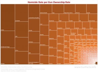
Treemaps (those funny looking charts composed of different sized rectangles) are fun in that they show the relative degree of the problem more effectively. As you can see, there are certain countries where dying is very likely when owning a gun is not.
But we ran into a problem. When we charted the data, we could not locate the United States in the treemap. So we had to color code it just to find it.
It is the little green spec in the lower right corner.


Thanks for the information. I constantly speak to people about our second amendment rights and your chart is just one more arrow in my quiver in support of our second amendment rights.
Where exactly are you getting this data? Because the data I’ve seen published by University of Washington’s Institute for Health Metrics and Evaluation is very different with America coming in 31st place in terms of gun related homicides. Below any european country and only just above the likes of Iraq.
Where is your data coming from?
The sources are cited in the lower left of each chart.
These charts show homicides, not “gun-related” homicides.
Overall homicide rates are the important measure — if I live somewhere where I have a high probability of being murdered, there is no advantage to me that it is less likely to be committed with a gun.
Alternatively, if I live somewhere where I am able to have a gun to protect myself, I can cut my personal risk considerably… even though in doing so, I might be contributing to “gun-related homicides” myself (since a self-defense fatality is technically still homicide).
See https://www.gunfacts.info/blog/gun-deaths-meaningless-metric/